So for this blog post, I wanted to do something different, and breakdown my latest piece step-by-step. This is a piece that I call "I'm a Bad Motivator" and it's making fun of the Motivational/Demotivational posters that are so popular on the internet and the scene in Star Wars: A New Hope where R5-D4
blows a motivator. To begin the very first thing I did was sketch out R5. I have a custom chalk brush that I use, that I've found when I use it at 60% opacity, it makes the PERFECT sketching brush.
Now for this piece I tried something different. In the past I've had a very hard time turning my rough and loose sketches, into clean, crisp, line art. I've always stayed away from Illustrator, as frankly I don't know how to use it, which means I've stayed away from the pen tool in Photoshop as well. That changed after I watched
this tutorial, which showed me a way to use the pen tool that I didn't previously know about.
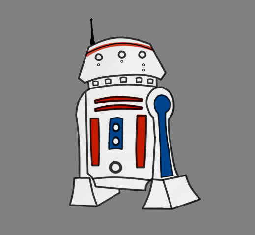
Now that I've finished my line art, I went back in and blocked out the basic colors I would be using. In the case of this piece they were; white, red, and blue.
After I had my color blocked in, I went back and roughly painted in some light shadows, highlights, and details. Nothing too noticeable, just enough so that the picture no longer looked flat and boring.
The next step was to add in the teardrop and the spot light effect. The way I made the spot light was using a custom shape I made and filling it with a custom gradient of mine (one I learned from watching one of
Chris Oatley's videos. I then made a second shape, this time filling it with a radial version of that previous gradient. After applying a Gaussian blur to it, and adding a black background, I got this.
One of the last steps I did was to go back in and add a lighting layer to the whole piece. I typically make an overlay layer above everything, fill it in with 50% gray, and then use the Burn and Dodge tools to add in shadows and highlights. The final step I did was add a shadow to R5 by duplicating the color layer, filling it in with black, and then warping it so that way it looked like it was laying on the ground. I then when over that layer with a low opacity eraser, so that it faded away, much like a real shadow.
The final step was to make a "Motivational Poster" template, add in my text and the finished painting, and TAH-DAH!
Well I really hope you liked this breakdown! In the future I might do some more of these. Please feel free to share this post with anyone you know if you think they might get something out of it. Personally, as a beginner in digital art, I love watching an artists process, so posts like these have really helped me out in the past.
Thanks and I'll see you next time!
~Josh


No comments:
Post a Comment