Showing posts with label digital painting. Show all posts

Thursday, October 30, 2014

Freelance Fun! - A Very Steampunk Wedding

So recently I was hired to do a Steampunk inspired illustration for a wedding. The clients best friend was the bride, so she wanted a piece done of the bride and groom together in a clock tower with the time set at their wedding. I was provided with a few pictures of the couple, a description of their outfits and a layout sketch of what the piece should look like. From there I came up with this sketch, which I sent to the client.


After the client approved the sketch, the next step was to line the piece!


The next step was to add some color!


Finally, all that was left was to add some textures, effects, and color correction, which leaves us with the finished piece!


And thats it! As always thanks for stopping by and enjoy!

~Josh


Tuesday, September 30, 2014

Freelance Fun - Light Flight!

As many of you know, in addition to being an artist, I'm also a Magician! I'm really lucky to be friends with Jeff Prace, one of the smartest magicians I've ever met! Recently Jeff came up with a great magic trick where the logo from a borrowed Bic Lighter appears on his own lighter. Jeff asked me to help him come up with some packaging for this trick so he could give it out at a lecture he had in August.

Previously Jeff had me paint a concept art piece for him for a trick he's working on and he wanted another hand painted image for the packaging. I thought it might be interesting to see the evolution of the packaging from start to finish.


As you can see it went through several iterations before we arrived at the one Jeff liked the best! Sometimes it was as simple as changing a font, other times it was just moving something over a few pixels.

If you're interested in Jeff's magic, you can check it out at his site here!

As always enjoy!

~Josh

Thursday, July 31, 2014

Product Review - Mischief

Recently I was provided a copy of this fantastic painting program called Mischief. What makes Mischief unique, amongst painting programs is the fact that it is a vector painting program. What that means is that you can scale your image as large or as small as you want and you will never lose quality. It also has an "infinite canvas" so you can literally paint as much as you want and never have to worry about size. In the Digital Media world, if you are doing any sort of graphic design work, you typically will use a vector program like Adobe Illustrator. The downside of Illustrator, as opposed to a program like Photoshop, which is NOT a vector program, is that you don't have as much freedom when it comes to the organic qualities of a painting program. This is where Mischief comes in. It combines that incredible painting capabilities of a program like Photoshop, while allowing you to do vector work like Illustrator. As someone who dislikes using Illustrator, but needs to do vector work, this was a godsend.

The Mischief user interface

Up until now the only program I've used to paint is Photoshop, so I was excited to give this a try. The layout is pretty simple, with your layers, tools, and brushes all on the right side of the screen. Mischief comes preloaded with a few different digital pens, pencils, markers, highlighter, etc. Below your drawing tools, there is a section called paper, which allows you to choose form a variety of paper textures. This is really cool as it allows you to replicate the feel of working in a traditional medium! For the pens you are also able to control the size and opacity of the pen, along with the color. For the paper, you can control the strength of the texture along with the color. What's interesting about both of these sections is you can save up to 6 different color presets. So if you have certain colors you use all the time, this is a great way to keep them organized. Unfortunately it looks like you are limited to only 6 colors. Additionally if you know the specific Hex key for your color, there is no way to select that specific color, which is a bit of a let down.

The various paper textures included with the program

Now anyone who knows me knows that when I learn a new program I like to learn all of the hotkeys. Mischief has gone ahead and under the help menu included a nifty little list of all of the programs hotkeys. I was very glad to see this as it made learning to use the program a lot easier! I was also very pleased to see that there were actions already programmed in to flip your layers and you canvas, which is a feature I use quite often! The only shortcut I couldn't seem to find was a shortcut to clear the entire canvas. There is a command to do that under the "Edit" menu, but for some reason there isn't a shortcut. I would have liked to see that included, so perhaps in a future update that can be implemented. One thing that was really nice to see though as a Photoshop user, is that the majority of the hotkeys are the same as those in Photoshop, which made switching between the programs very simple!

List of all of the shortcuts in Mischief

Now when I opened up the program for the first time, I was a bit confused as I'm used to seeing my brushes when I use them, so I can know what the size is. For some reason the default setting in Mischief is to just use your cursor icon. Now there is a way to fix that, if you go to your preferences, found in the Edit menu, you can change it from the cursor to the pen cursor. There are also options for using a crosshair or nothing at all, but I prefer the pen. In my opinion, I would've made the pen the default, as I feel that's what most people would be accustomed to. One little glitch I have found with the pen cursor is that when you swap from your brush to your eraser, the size of the icon doesn't change. You have to hit your bracket key to make the change. This can be a pain if you are using a large eraser and a small pen, as you might get confused.

One SUPER cool feature that Mischief has is what it refers to as a "See-Thru Window." This turns Mischief transparent so you can see whatever you have open behind the program! This is amazing because if you need to trace something or want to have reference on hand, it turns the program into a light table. I LOVE this feature, and think that it's absolutely brilliant! You can also change the opacity of this feature to suit your needs. 

The See-Thru Window in action!

Mischief will allow you to export your entire visible canvas or specific sections of the canvas as either PSDs, JPEGs, or PNGs. You can also import JPEGs directly into the program. Overall I was very happy with Mischief! There were a few minor things that would be nice to have. Perhaps having more brushes, or the ability to add brushes. Also having a dedicated hotkey to clear the canvas would be nice as well. Other than that, I would highly recommend this product! I tested it out on PC but there is a Mac version as well. I also used my Wacom Intuos for this review, not my GT-190, so I will update this review once I'm able to test it with that. You can purchase Mischief at their site for $65. I would give this product an 8.5/10

Here are links to Mischief's site and their social media sites.

Website - http://www.madewithmischief.com
facebook - https://www.facebook.com/madewithmischief
twitter - https://twitter.com/GetMischief
tumblr - http://madewithmischief.tumblr.com/

As always thanks for stopping by and enjoy!

~Josh

Monday, June 30, 2014

Groot - Piece Breakdown


With the new Marvel film "Guardian's of the Galaxy" coming out soon, I recently painted a portrait of one of the main characters of the film, Groot. This post will be a quick and dirty breakdown of the piece.


As always I began with a sketch. I honestly don't know a lot about this character so I had to use a lot of reference to get him to look right.


Next I added in the color. Originally I wasn't planning on keeping the sketch in there, but I kinda liked how it ended up looking so I kept it.


Normally the last step would be to add a background and call it a day, but I felt that the piece was a bit too flat and didn't really stand out.


After some tweaking, I finally got it to a place where I was happy. And there ya go! Groot from start to finish.

As always I hope you enjoyed!

~Josh

Sunday, June 29, 2014

Troll Concept - Piece Breakdown

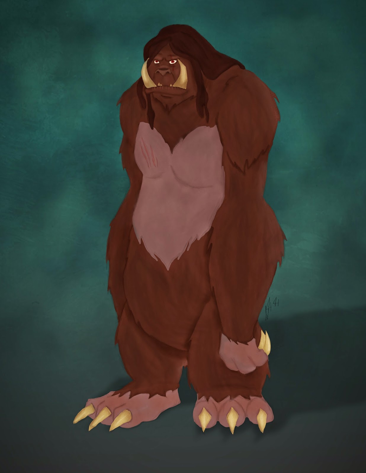
Recently I finished reading the Artemis Fowl series. I know, I know what took me so long? The thing is I actually read up to the Lost Colony and then life got in the way, so I decided to start from Book One and read all the way through. I decided that I wanted to do some concepts of how I saw the characters, and one of the characters I had the most vivid image of in my head was the Trolls. I just found their description so fascinating so I had to paint one. Here's what the official Artemis Fowl Wiki page has to say on Trolls.

As you can see that is one hell of a description. With this piece I wanted to do something in my usual style, but I didn't want it to look like a normal piece that has lineart. Instead I wanted to do something a bit more painterly. However before I could get that far I needed a sketch!


Now one thing I typically have an issue with is conveying my thoughts when it comes to art. I'll have a clear idea, but the moment I try to draw it, I just can't seem to get it right. This is one of the SUPE rare instances where I was able to draw EXACTLY what I saw in mind! I was happy with my sketch so the next step was to add color.


Like I said, I wanted to avoid my typical art piece and not line  the work, so I decided to block in the color in a similar fashion to how I approach a portrait. Now typically when I have a portrait I'm painting, I have reference of some sort to base the lighting and the different colors off of. With this piece, I obviously did not have that luxury, so instead I had to figure it out on my own. This was a bit of a challenge, so I knew I had to go back and add a little bit more to the painting to get it just right.


And there ya go! One troll concept from start to finish! Like I said I was really proud of this piece for two reasons. One it was one of the first times I was able to convey EXACTLY what I was thinking, and two this was the first time that I had a super clear image in my head of a book character and was actually able to show what they looked like.

As always thanks for stopping by and enjoy!

~Josh

Tuesday, June 24, 2014

How to Train Your Stitch - Piece Breakdown

A few weeks ago when How to Train Your Dragon 2 came out, I went and saw it opening day. I absolutely LOVED the film. For those who know me, they'll know that Stitch from Lilo and Stitch is one of my favorite animated characters. Well, Chris Sanders, the man behind Stitch, is also one of the men behind the creation of Toothless, another of my favorite characters. Since I'm a big fan of Chris' work, I decided that I wanted to do another mashup piece, this time combining Stitch and Toothless. I started out with several concepts as to what a "Stitchless" might look like.


I wasn't too happy with any of these, so I decided to instead jump right into Photoshop and just begin to sketch. Initially in these concepts I tried to combine aspects of Stitch and Toothless into a new creature. I decided my best approach would be to take Stitch's design and then modify him to look more like Toothless, which resulted in this sketch.


Now that I had a sketch I was happy with, I went back and cleaned up the art.


I was pretty happy with how the lineart turned out so the next step was to add color!


Now that the color was done, the final step was to add a shadow and recreate the How to Train Your Dragon and Stitch Logos


And there we go! The finished piece! I hope you guys enjoyed seeing the process behind this one. I plan on doing more breakdowns like this in the future where I include the original concepts.

As always enjoy!

~Josh

Thursday, February 27, 2014

Matte Painting Time!

So with over a month left before our film is finished its time to start rendering out frames from the film and to begin the matte painting process. Check out this post about matte paintings if you want to learn more. As you know our film takes place in a nebula environment and in one shot we see the nebula from space. I was asked to do the matte painting for this shot and heres the final product!


As always I hope you enjoy!

~Josh

Thursday, January 23, 2014

From Concept to Creation

So as a result of working on Celestial, I have gotten really good at painting planets. Because we are now entering the final stages of production, our texture lead Ward Silverman (check out his site here) has been pumping out some planets with some KILLER textures. Because our film is so planet heavy, today I gave Ward a concept painting I did of a lava planet. I have to say it is really awesome seeing something you painted come to life right before your eyes. Rather than talk about how awesome of a job Ward did, I decided to use this blogpost to show you! I'm currently working on a visual development reel, so this is one of the pieces I will include.

This is the original concept painting I did.


 And this is the finished render of Ward's planet


As you can see Ward did a killer job!

Thanks for stopping by and make sure you check out Ward's site!

Enjoy!

~Josh

Monday, December 9, 2013

Indeed....

So in a few days it will be my good friend Chelsea's birthday! Now since she has given me a RIDICULOUS amount of animation help during the time that I've known her, I wanted to paint her something epic for her birthday. So after a conversation about how whenever she says "Indeed" it reminds me of someone super fancy, I decided to paint a ridiculously fancy version of Chelsea. I've always loved those portraits of celebrities that look like Russian generals so I decided to paint one of Chelsea. Here's the sketch I did first


I actually had Chelsea send me of a picture of her posed like this, but I never told her why. After getting it to look like her, I added some details to make uniquely Chelsea. After that was done, all that I had left was to paint it!


I was quite pleased with how it came out. I ended up printing it and getting it framed in a relatively fancy frame. Oh and for those of you worrying that this post will spoil the surprise... I already gave her the gift last time I saw her, since I didn't think I'd see her again before her birthday.

I have to say I'm really enjoying painting portraits and hope to do more soon.

As always enjoy!

~Josh

Friday, November 29, 2013

Disney Princess Wonder Woman - Piece Breakdown

So earlier this month, my good friend Ward Silverman told me about this auction a local comic shop was doing to raise money for charity. The theme of the auction was Wonder Woman and since I am a MASSIVE DC fan, I decided that I had to participate. I'm pretty pleased with how this piece turned out considering I lined it! Now in the past I've mentioned my dislike of line art and how I finally found a way involving the line tool in photoshop Since that post I've used that method a few times, most recently in this piece, however the one thing I haven't really liked about it is that it doesn't feel natural. With line art, I want to imitate the looseness of my initial sketch and I felt like with the pen tool, I wasn't able to accomplish that. However I recently found this tutorial which covered a way of lining that I had never tried before, and I must say I'm pretty proud of the result! Alright now that I've rambled on about line art, let's jump into the piece breakdown!

So the very first thing I did for this piece was to sketch out the post I wanted. I found some reference pictures online of Wonder Woman in poses and decided that the one I sketched out was the one I liked best.


After I finished the sketch, the next step was the long process of lining the piece. As I was lining this piece, I realized that the face I had was a bit too masculine and that the eyes weren't quite "Disney" enough, so I completely redid those.


The next step was to throw in some color. For this part of the process I just went with the flat base colors I wanted to use, as later I would add dimension with shading.


Now that the piece had color, it really started to come to life! I added shadows using my custom airbrush and used a method of picking color that my good friend Amanda Bell taught my last year.


At this point, I was really happy with the piece as it was all starting to come together.  Throwing in the highlights though, really did the trick.


The final step was to add in a background! I actually lied, because I made this background early on in the process, but I wasn't committed to it until the piece was done. All that was left was to throw in the Wonder Woman logo and to recreate the Wonder Woman title from the comics in a Disney-esque font!


The auction is on December 13th and the deadline to submit art is November 30th, so I hope that I can get this printed, mounted, and turned in on time. I really had fun with this piece as it let me get into my own art style a bit more. Now that I feel a bit more confident with my line art, hopefully I'll have more pieces like this soon. Also over Winter Break I plan on working a lot traditionally to hone my drawing skills, so expect those blog posts to be full of sketches!

As always thanks for reading and enjoy!

~Josh

Monday, November 18, 2013

Spock Portrait Tablet Class

So as most of you know, I learned how to paint by going to tablet classes that one of my seniors Trey taught each week. Since I'm now a senior, I decided to continue that tradition, and teach my juniors how to use their tablet. The first tablet class I taught how to paint a portrait and decided to draw Spock as our subject matter. It was a fun class, and the portraits turned out great. Here are some pictures from the class:


As you can see, we had a lot of fun! Now I didn't get a chance to finish my painting during the class, so I went back and worked on it and I finally finished it. First here's the sketch:


I was quite happy with how the sketch turned out, because I think it looks a lot like Zachary Quinto, which was exactly what I was going for. Several hours later, this was the final result:


There are a few things I might have changed, but overall I'm quite happy with the finished product. For someone who only recently started painting portraits, I feel like I have gotten the hang of them early on. As always thanks for checking out my blog!

Enjoy!

~Josh