Showing posts with label Art Breakdown. Show all posts

Friday, October 31, 2014

A "Fantastic" Selfie! - Piece Breakdown

Happy Halloween everyone! In honor of the holiday spirit, I thought it would be fun to do another Photoshop breakdown of my latest photo, which is also my Halloween costume this year! As you are well aware by now, my favorite Doctor from Doctor Who is the 9th Doctor! I previously made some Psychic Paper so I decided to complete my first ever cosplay! I wanted to take a really cool portrait to feature the costume, and I thought it would be funny if the Doctor was taking a selfie on the TARDIS! Here's how I achieved that photo!


The first step was to take a photo! I set up my green screen behind me to make it easier to remove myself from the background later on! I also used three lights to get myself nicely lit so I would somewhat match the background image I picked. You can actually see my lighting setup here if you're interested!


The next step was to remove the original background and place in my new background image.


This is where I really began to make the photo blend in with the scene. I did some basic color correction, removed the green spill leftover on the jacket, and got rid of the shadow cast on my face by my Sonic Screwdriver.


Now I added some shadows to the side of me and did a final color grade of the image so it match the background.


The final step for this part of the composite, was adding a lens flare to the sonic and a slight vignette.


Now I took another photo of myself taking a selfie. I didn't have any fancy lighting set up for this one, but I did make sure I chose a lens that would leave my background nice and blurry. This was important for later


Next I cut myself out of the original photo and threw in a blurry version of my background from the other photo.


The next step was to piece the background and foreground together and do some color correction to the foreground to match the scene.


Next I added in the composite image from earlier, and recreated the iPhone camera interface. I also added a slight glow coming from the screen.


The final step was to add a flare behind the phone, integrate the screen, do a final color grade, and voilĂ ! It was done!

I hope you guys liked this piece, I'm really really happy with it! Special thanks for my buddy Edward Boswell for giving me some great feedback while I working on the final composition!

Thanks for stopping by, I hope you have a happy Halloween and as always, enjoy!

~Josh 

Thursday, October 30, 2014

Freelance Fun! - A Very Steampunk Wedding

So recently I was hired to do a Steampunk inspired illustration for a wedding. The clients best friend was the bride, so she wanted a piece done of the bride and groom together in a clock tower with the time set at their wedding. I was provided with a few pictures of the couple, a description of their outfits and a layout sketch of what the piece should look like. From there I came up with this sketch, which I sent to the client.


After the client approved the sketch, the next step was to line the piece!


The next step was to add some color!


Finally, all that was left was to add some textures, effects, and color correction, which leaves us with the finished piece!


And thats it! As always thanks for stopping by and enjoy!

~Josh


Saturday, July 12, 2014

Toothless - Piece Breakdown

I thought it might be fun to show my process for editing my latest photo. I recently got a new camera, a Sony A77, which is a BEAST of a camera. Something that I've always found fascinating is macro photography of toys and action figures. I love it when the photographer uses them as if they were real life models and tells a story with the piece. As you know I'm a huge fan of How to Train Your Dragon, so I decided to do a macro photo of my Toothless figurine. Here is the original photo straight out of the camera.


It's not too bad of a photo, but I know that I could do so much more with it. Here's what I did:


The first thing I did was recompose the shot to match with the rule of thirds.


Next I did some cleanup to the background, getting rid of some stray pieces of grass.


Since I wanted Toothless to be the focus of the image, I sharpened him up a bit.


This step is probably really subtle, but I added some dust by the light source to add a bit of atmosphere to the piece.


While I had some really nice background defocus going on, I wanted to add a bit of bokeh as well.


Now that I had most of the touchups done, I did some basic color correction to make the greens really pop.


Something I did on this piece, since I was trying to tell a story, was add some widescreen bars to make it feel a bit more cinematic.


I also added a vignette to add to the cinematic feeling a bit. Plus I really like vignettes haha


And here's the final image! I added a lens flare to the image, whichI think really pulled it all together!

Well there ya go! Just a quick little look into how I edited this piece. Hopefully you guys like the finished product as much as I do.

Thanks for stopping by and as always enjoy!

~Josh

Monday, June 30, 2014

Groot - Piece Breakdown


With the new Marvel film "Guardian's of the Galaxy" coming out soon, I recently painted a portrait of one of the main characters of the film, Groot. This post will be a quick and dirty breakdown of the piece.


As always I began with a sketch. I honestly don't know a lot about this character so I had to use a lot of reference to get him to look right.


Next I added in the color. Originally I wasn't planning on keeping the sketch in there, but I kinda liked how it ended up looking so I kept it.


Normally the last step would be to add a background and call it a day, but I felt that the piece was a bit too flat and didn't really stand out.


After some tweaking, I finally got it to a place where I was happy. And there ya go! Groot from start to finish.

As always I hope you enjoyed!

~Josh

Sunday, June 29, 2014

Troll Concept - Piece Breakdown

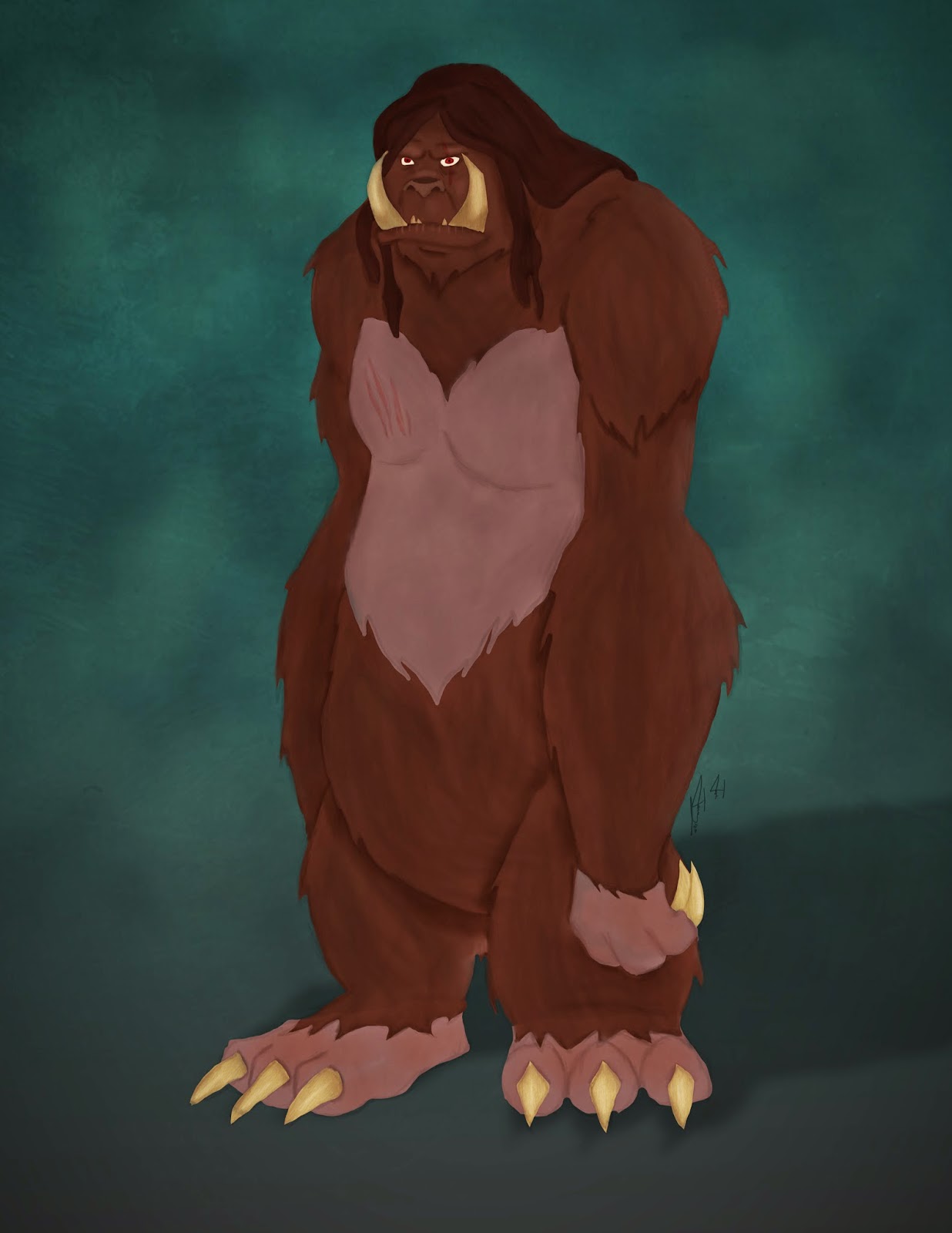
Recently I finished reading the Artemis Fowl series. I know, I know what took me so long? The thing is I actually read up to the Lost Colony and then life got in the way, so I decided to start from Book One and read all the way through. I decided that I wanted to do some concepts of how I saw the characters, and one of the characters I had the most vivid image of in my head was the Trolls. I just found their description so fascinating so I had to paint one. Here's what the official Artemis Fowl Wiki page has to say on Trolls.

As you can see that is one hell of a description. With this piece I wanted to do something in my usual style, but I didn't want it to look like a normal piece that has lineart. Instead I wanted to do something a bit more painterly. However before I could get that far I needed a sketch!


Now one thing I typically have an issue with is conveying my thoughts when it comes to art. I'll have a clear idea, but the moment I try to draw it, I just can't seem to get it right. This is one of the SUPE rare instances where I was able to draw EXACTLY what I saw in mind! I was happy with my sketch so the next step was to add color.


Like I said, I wanted to avoid my typical art piece and not line  the work, so I decided to block in the color in a similar fashion to how I approach a portrait. Now typically when I have a portrait I'm painting, I have reference of some sort to base the lighting and the different colors off of. With this piece, I obviously did not have that luxury, so instead I had to figure it out on my own. This was a bit of a challenge, so I knew I had to go back and add a little bit more to the painting to get it just right.


And there ya go! One troll concept from start to finish! Like I said I was really proud of this piece for two reasons. One it was one of the first times I was able to convey EXACTLY what I was thinking, and two this was the first time that I had a super clear image in my head of a book character and was actually able to show what they looked like.

As always thanks for stopping by and enjoy!

~Josh

Tuesday, June 24, 2014

How to Train Your Stitch - Piece Breakdown

A few weeks ago when How to Train Your Dragon 2 came out, I went and saw it opening day. I absolutely LOVED the film. For those who know me, they'll know that Stitch from Lilo and Stitch is one of my favorite animated characters. Well, Chris Sanders, the man behind Stitch, is also one of the men behind the creation of Toothless, another of my favorite characters. Since I'm a big fan of Chris' work, I decided that I wanted to do another mashup piece, this time combining Stitch and Toothless. I started out with several concepts as to what a "Stitchless" might look like.


I wasn't too happy with any of these, so I decided to instead jump right into Photoshop and just begin to sketch. Initially in these concepts I tried to combine aspects of Stitch and Toothless into a new creature. I decided my best approach would be to take Stitch's design and then modify him to look more like Toothless, which resulted in this sketch.


Now that I had a sketch I was happy with, I went back and cleaned up the art.


I was pretty happy with how the lineart turned out so the next step was to add color!


Now that the color was done, the final step was to add a shadow and recreate the How to Train Your Dragon and Stitch Logos


And there we go! The finished piece! I hope you guys enjoyed seeing the process behind this one. I plan on doing more breakdowns like this in the future where I include the original concepts.

As always enjoy!

~Josh

Friday, November 29, 2013

Disney Princess Wonder Woman - Piece Breakdown

So earlier this month, my good friend Ward Silverman told me about this auction a local comic shop was doing to raise money for charity. The theme of the auction was Wonder Woman and since I am a MASSIVE DC fan, I decided that I had to participate. I'm pretty pleased with how this piece turned out considering I lined it! Now in the past I've mentioned my dislike of line art and how I finally found a way involving the line tool in photoshop Since that post I've used that method a few times, most recently in this piece, however the one thing I haven't really liked about it is that it doesn't feel natural. With line art, I want to imitate the looseness of my initial sketch and I felt like with the pen tool, I wasn't able to accomplish that. However I recently found this tutorial which covered a way of lining that I had never tried before, and I must say I'm pretty proud of the result! Alright now that I've rambled on about line art, let's jump into the piece breakdown!

So the very first thing I did for this piece was to sketch out the post I wanted. I found some reference pictures online of Wonder Woman in poses and decided that the one I sketched out was the one I liked best.


After I finished the sketch, the next step was the long process of lining the piece. As I was lining this piece, I realized that the face I had was a bit too masculine and that the eyes weren't quite "Disney" enough, so I completely redid those.


The next step was to throw in some color. For this part of the process I just went with the flat base colors I wanted to use, as later I would add dimension with shading.


Now that the piece had color, it really started to come to life! I added shadows using my custom airbrush and used a method of picking color that my good friend Amanda Bell taught my last year.


At this point, I was really happy with the piece as it was all starting to come together.  Throwing in the highlights though, really did the trick.


The final step was to add in a background! I actually lied, because I made this background early on in the process, but I wasn't committed to it until the piece was done. All that was left was to throw in the Wonder Woman logo and to recreate the Wonder Woman title from the comics in a Disney-esque font!


The auction is on December 13th and the deadline to submit art is November 30th, so I hope that I can get this printed, mounted, and turned in on time. I really had fun with this piece as it let me get into my own art style a bit more. Now that I feel a bit more confident with my line art, hopefully I'll have more pieces like this soon. Also over Winter Break I plan on working a lot traditionally to hone my drawing skills, so expect those blog posts to be full of sketches!

As always thanks for reading and enjoy!

~Josh

Thursday, July 25, 2013

There's A Hero Inside Us All - Piece Breakdown

So this is a piece I have spent countless hours on! I think I've been working on this one for close to two months. A while back I saw a really cool photo of Heath Ledger as the Joker where half of him was in make up, and the other half was his actual face. I really liked the idea of having a piece where one person is split down the center (in fact three years ago I did a stylized self portrait based off of that idea!) I decided that instead of doing the Joker, I would go with a Hero for this piece, and play off of the theme that everyone has a hero inside of them. Now I'm a diehard DC Comics fan, but I decided to go with Captain America for this piece, mainly because I felt that Steve Rogers was a good example of someone who really embodied this concept.

The first thing I did was go to Photoshop and make a SUPER rough mockup of the concept I had in mind. I decided to go with the current movie version of Captain America, as I felt that it would be a version of the Captain that most people would recognize. I actually had a hard time finding a good front facing shot of the Captain, so I had to combine a few images to make the mockup. Next I found a picture of Chris Evans, who portrays Captain America to use as reference for the Steve Rogers side of the piece.


Now that I had my mockup, the next step was to sketch out the piece. I have the problem that most things I draw are stylized and slightly cartoon-esque, which I didn't want to happen with this piece. With that in mind I decided to try a technique that I normally don't use, which is using a grid to sketch. I placed a grid over my reference image and then a grid on my blank canvass in order to the sketch to resemble the original photo. I was pleasantly surprised with the result, and I think that I will be using this technique for portraits more often.


Now that I had my sketch the way I wanted it, all that was left was to paint. As I said before I wanted to try and avoid a stylized work, so I had to make sure that no line art was involved. I found a fantastic tutorial on portrait painting by Roger Fletcher which really helped out with the painting process. Finally the final steps were to add the text I wanted to use and then figure out a background. I decided to go with a recruitment poster that transitioned into an American flag, as I felt that it both fit the theme of the piece and the subject matter.


For a first attempt at a photorealistic piece, I'm quite happy with it. I know that there is a lot I could improve on, but I really love how this turned out in the end! Well I hope you like the piece and enjoyed reading about my process for this one. I have another portrait in the works already, so I can't wait to get back to working on that!

Until next time!

~Josh

Tuesday, June 25, 2013

Cinematic Matte Painting

So one thing I have been super interested in this past year are matte paintings. For those of you who don't know what a matte painting is, a matte painting is a painted representation of a landscape, set, or distinct location that allows filmmakers to create the illusion of an environment that would otherwise be too expensive or otherwise impossible to film or visit (thank you Wikipedia!). Basically what a matte painter will do is combine paintings with photographic elements (and sometimes 3D elements) to make a scene. You'd be surprised at how many of your favorite movie or TV shows contain matte paintings. Fun Fact: Before computers, matte paintings were exactly what they sound  like, photorealistic paintings.

Ok enough with the history lesson! Like I said I found the subject of matte paintings to be super interesting, so I decided to try my hand at it! One of my guilty pleasures are doomsday films, and what would a doomsday film be without a post apocalyptic shot of our nations capital! Heres a shot of the US Capitol building I found online.


Now heres that same image, but manipulated to look like it went through hell and back!


TAH DAH! One post apocalyptic DC shot at your service! This piece took around two hours to complete from start to finish. It was made up of a combination of photo manipulation and painted elements. In the end I used around 27 different layers to create this I'm pretty happy with how this turned out, considering it was a first attempt. If you have an idea for any matte paintings, feel free to leave a comment down below!

If you're interested in learning more about matte paintings, check out this awesome documentary on the subject.  All the matte paintings you'll see in this are traditionally done, nothing digital about any of them! And if you want to see some examples of modern matte paintings, check out this video!

As always thanks for checking out my work!

Enjoy!

~Josh

Friday, June 21, 2013

Han's Shot First

So a few weeks ago I posted a Demotivational poster of R5-D4 that I painted. I decided that I wanted to print it up for my desk at school next semester. That got me thinking that I want to start making and selling Geeky prints. I was recently on the site imgur where I saw this picture of Harrison Ford pouring shots. Suddenly I found myself thinking of the age old debate of who shot first, Han or Greedo, and thus this latest piece was born.

This time I decided to set out to try something different. I wanted to an entire painting without any linework whatsoever. I have done that before with landscape and environments (see my first blog post here for an example) but I have never done that with characters. The first step was finding the right reference photos. Obviously I found plenty of pictures of Han, Greedo, and the Cantina, but I also looked up photos of people drinking shots. I myself don't drink alcohol, so I knew that relying on my memory for this pose wouldn't work out. After finding the right pose I began to sketch out the piece and got this:


Now that I had my sketch done I began to fill in the base colors of each part of the piece so I could get an idea of my palette.


Once I was happy with how this turned out, I began to add value. After getting some great tips from my friends J.P. Perez and Amanda Bell, who are both FANTASTIC artists who regularly sell their work at cons, I finally felt that I was happy with the piece. 


All that was left was some minor color correction to better fit the atmosphere of the piece and voilĂ !

I'm pretty happy with  this piece, and I plan on making prints available of this, and the Bad Motivator on very soon!

As always thanks for reading and enjoy!

~Josh